Design Objective
Our goal for our app, Sprouted, was to create a space that would connect plant lovers and enthusiasts with the same common goal of fostering a healthy environment for their plants. While also educating new household plant owners who may be struggling with staying accountable for their new household plants. Sprouted is an app designed for android/google where you can monitor your plant’s needs and connect with fellow users about plant inquiries. On the app, you can monitor your plant’s watering needs, how much sunlight they require, and its healthy soil requirements. There is also a calendar within the app where you can physically mark which days you watered and changed your plant’s soil so you never lose track. The fact that it is an app makes it more accessible and functional for users because they can access it anywhere. As for the design of the app, we wanted to keep it clean and simple like the nature of a plant. Our overall goal for this app is to educate household plant owners that may not know how to properly care for their plants, while also appealing to passionate household plant owners wanting to stay accountable for their plant’s health.
Project Concept
Sprouted helps plant owners keep their home plants at peak quality year-round. Sprouted keeps track of your plant’s needs in relation to location, weather/seasons, and owners’ schedule. It allows any plant owner to maintain a routine and develop an understanding of their specific plant’s needs. Along with a detailed description of characteristics, origins, and life-cycle, it will recommend the appropriate watering schedule, proper soil for peak growth, and sunlight requirements to keep each plant thriving. Sprouted will help the user create routines to properly care for each plant’s specific needs. Sprouted will also allow users to connect with other plant owners by creating a platform where they can share photos and ask each other questions to create an inclusive learning environment.
Press Release
https://paytonaugusta.design.blog/2019/12/09/sprouted-press-release/
Usability Research Highlights
For our user research, we recruited by association, so we spoke to family and friends who also share an interest in household plants. We asked them a series of questions regarding their overall usability experience, satisfaction, and information in accordance with the structure of the application. We prompted questions like, Did you find this information helpful? Was the app easy to navigate? Would you utilize the “get connected” tab if you were a user? And we also asked for constructive criticism at the end of the series of questions. One of the biggest complaints about our first draft was the readability, we had a few testers stating that they had quite a bit of difficulty reading the body copy. Overall our testers appreciated our app and would use it for themselves, although we had one user who didn’t see the point of the app and wasn’t likely to use the app. Her critiques really helped up rethink our approach to users and also the functionality of the app. Another critique we saw was a lack of visually identifiable plants, so we went back in and made profile pictures, so to speak, for each plant. Our user testing gave us a lot to work with and we were able to learn quite a bit about what worked and what needed adjustments.
Highlight Reel
https://www.trymyui.com/pra/M1I67eOd5khKgJJ7
Usability Research Report
https://docs.google.com/document/d/16WtVvILUhpBxaqYvQTnmh91EVWDF3N64qrNPhlDZ7hw/edit?usp=sharing
Proto Persona
Sprouted is aimed for people who are passionate about plants but lack a green thumb. It is designed to help these individuals create the best environment for all of their plants, making it easy and accessible for all users. We want to appeal to a wide range of individuals, young and old.
High Fidelity Screen Designs
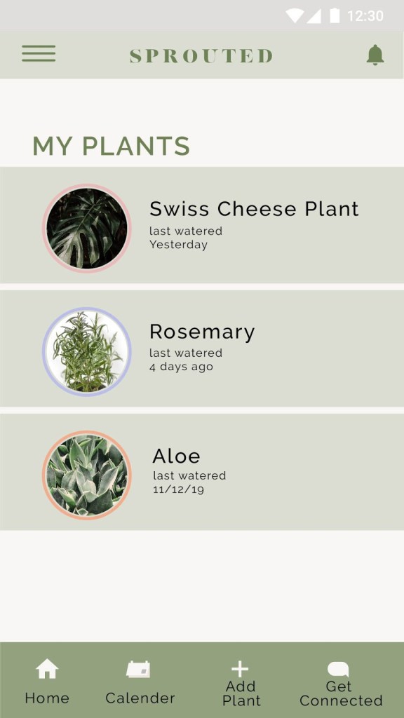
The first image titled My Plants is essentially the homepage of the app. It lists all of the plants you have added and informs you of when the last time you watered each one. You can click or tap each plant to find more information about each plant. You can see all the details about how much sunlight each plant requires, what pH level the soil for each plant should be, and how much it should be watered.
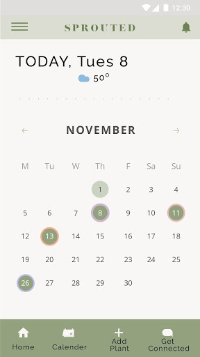
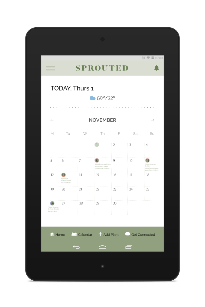
The second image is the calendar within the app that reminds you when that last time you watered each plant and gives you reminders on when to water them again. It also informs you on the weather for the plant’s needs.
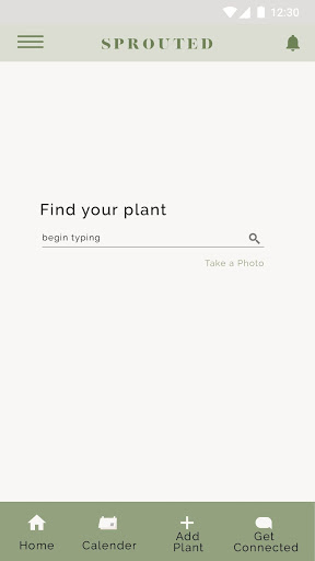
The third image is the page dedicated to adding new plants to your list. You simply search the name of the plant and click the appropriate plant. Then it will simply be added to your plant page and add all of the necessary requirements to your calendar as well.
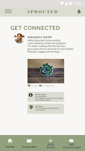
And finally the fourth image is the Get Connected page, where you can connect with others on the app and communicate with them about your inquiries.
Tablet App Screens
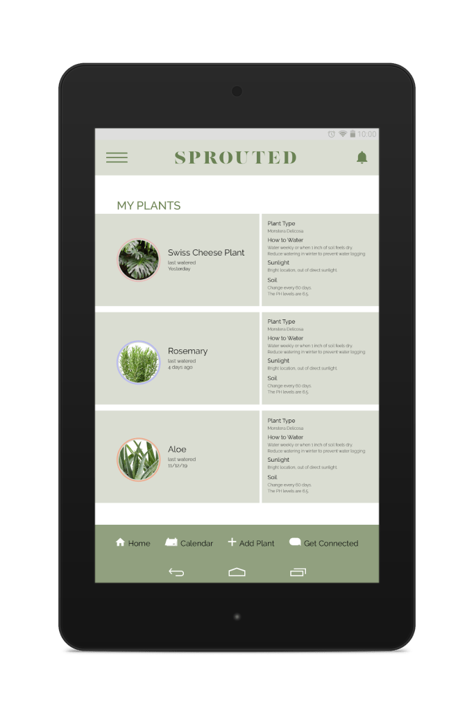
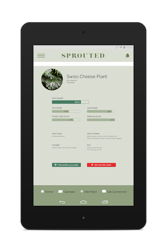
The first tablet screen is the homepage, this is where you can see your plant list and all you plants needs. It differs from the mobile designs because instead of it being two separate screens it’s all on one. You can see not only your plants but you can see all the plants needs such as how much water and sunlight they need and the pH level of the soil the plant needs in order to stay healthy.
The second screen goes into more detail about each plant and monitors the plants overall health. We don’t have this in the mobile design because it wouldn’t be as readable on the mobile design. Due to the tablets size, we could add more information like this.
And the third image is the calendar like the one on the mobile design. But it too goes into more detail about when you last watered it instead of having to click into each day.
Interactive Prototype
Project Retrospective
The thing I found most challenging about this project was the schedule of all of the assignments. Due to fall break it felt like we didn’t have as much time as the previous project, at least in class. It was also a bit challenging that fall break was so late, by the time we got to the third project I felt burnt out and found it more difficult to get started. And because fall break was the week before presentations it felt like more work leading up to the presentation because my group and I knew we weren’t going to be able to work much over the break.
The most valuable lesson I learned throughout this project is time-management. This plays into what was challenging about this project for me. During the week of fall break I had no time to work on any of my responsibilities out of the group. So the Sunday before presentations I was left to do a little more work than I had planned. If I would have managed my time properly I would have been less stressed and a little bit more prepared.
